This project, conducted as part of Digital Humanities 110 in Spring 2022, involved redesigning Ultimate-Guitar to be more user-friendly for both beginner and advanced guitar players.
Throughout the course of the quarter, I went through the research and design process, starting with heuristic analysis and user research
to designing and testing my own prototype on Figma.
As a novice-intermediate guitar player who learned guitar through Ultimate-Guitar and Youtube videos, I was curious as to how to make this process easier for newer players while
still retaining long-term users and more advanced players. For context, my target audience for this project was middle-aged men interested in guitar learning.
For this project, I identified the issues to be a non-intuitive labeling (using "Shots" instead of "Videos"), overall design clutter, and lack of flexibility or features like annotation. Overall, this website seemed tailored to long-term users and advanced guitar players, thus excluding a significant portion of their potential userbase.
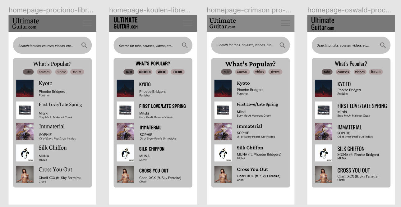
I conducted heuristic analysis on the original Ultimate-Guitar site to identify potential design flaws. I then compared the heuristic results from Ultimate-Guitar to ones obtained from Chordify, a similar guitar tab and course site.
Overall, I found that Chordify fared better in all of the heuristics except helping users diagnose errors, help and documentation, recognition rather than recall (due to unclear labeling in the tab interface), and flexibility (too much emphasis on interactivity). On the other hand, Ultimate-Guitar was too inconsistent (using the term "Shots" rather than "Videos"), inflexible (too much focus on advanced users), and suffered aesthetically (too much clutter and unnecessary information).
Following heuristic analysis, I identified potential sources of improvement in Ultimate-Guitar's design. I then needed to corroborate these flaws with actual users.
Read more about heuristic analysisTo corroborate my heuristic analysis and to identify more potential improvements in Ultimate-Guitar's design, I used my heuristic analysis to create four tasks for a pilot usability test.
I designed these tasks to encompass the four main features of Ultimate-Guitar: the courses, the tabs, the videos/Shots, and the forums. My participant said that the website looked difficult to use; they also had some trouble navigating the guitar tabs.
Following this pilot usability test, I gained insight into how a user would interact with the website and how I, as a UX researcher, should moderate a UX test.
Read more about usability testingAfter identify potential improvements to the original Ultimate-Guitar site, I was interested in how potential users interact with guitar tabs and sheet music, unconstrained by an app or website. To study this, I conducted an interview with a piano player who also played guitar and drums on the side. Following the interview, I observed a small-group ensemble's rehearsal.
My findings included that musicians tend to mark up their sheet music with notes about tempo/fingerings, that they like to play with a backing track (with options to slow down or speed up the song), and that playing in groups helped keep musicians motivated to practice.
Using these insights, I was ready to start thinking about potential users for my redesign.
Read more about contextual inquiryAfter studying potential users, I developed two personas:
I then created empathy maps for each persona, as well as two scenarios related to these personas, including learning the basics of guitar through Ultimate-Guitar's courses and browsing videos to find new techniques and chord progressions.
With these personas and scenarios, I was ready to start prototyping!
Read more about the personasUsing my personas and scenarios and the four tasks in my pilot UT, I created a low-fidelity prototype of my proposed redesign.
After the first version of my low-fidelity prototype was ready, I had a user trace through my wireflow and make suggestions based on where they got stuck. Using their insights (such as identifying unclear labels), I created a revised version to use in future steps.
Access the low-fidelity prototypeAs my low-fidelity prototype had no design elements, I selected my prototype's homepage and made design iterations with the interface's grid layout, shapes, and color schemes. Both a dark and a light mode were created, and the color contrasts were verified to pass at a WCAG 2.1 AA level.
I then conducted an impression test on my potential interfaces, and based on my participant's feedback, I chose an interface to use in future steps.
Access the proposed interfacesI digitized the low-fidelity prototype with Figma and added interactivity. I then revised this design through a cognitive walkthrough, where my peers went through the persona scenarios from Step 4 and identified any potential pitfalls in my design.
Finally, I conducted four usability tests (average age: 39; all identifed as male) and created three iterations of my prototype. From the UT, I calculated a SUS score of 77.08 and analyzed the production satisfaction card. These changes included changing the placement of the Tempo and Key buttons, adjusting the spacing of tabs to fit more lyrics onto the screen, and removing the album art and making it into a banner instead.
Access the high-fidelity prototype(s) and UT hereA longer and more thorough (10 min) version of the pitch can be found here.
Overall, I enjoyed going through the user research and design process a lot!
I didn't expect to have so much fun doing the contextual inquiry, so that step was definitely one of my favorites. Looking back at my goals to declutter Ultimate-Guitar and to make it more accessible to beginner guitar players while still providing advanced users flexibility, I think I was able to fulfill most of those goals, as evidenced from my prototype UT tests! The prototype is far from perfect though (as is the case with all designs), and I think another round of research into annotation and transposition could be helpful. That way, we could find if guitar players don't annotate guitar tabs the same way as classical musicians with their sheet music. Thus, this project can be part of a larger project with many more design iterations.
The hardest part of the design process was the interface design and recruiting members from my target audience for UT. It was difficult selecting colors that would maintain enough color contrast while minimizing the number of hues in the design, and I also had the issue of choosing whether to maintain Ultimate-Guitar's black-yellow color scheme despite my impression test indicating that the scheme appeared outdated. UT recruitment was difficult as well, hence why two of my prototype's UT participants were college-students rather than middle-aged. Nevertheless, Professor Sookie provided me with one potential connection, which helped me recruit another participant through snowballing. Conducting these UTs also illustrated how demographics play a large role in how someone interacts with a website, which was something I hadn't considered before.
In the future, aside from conducting more research, I'd want to refine my color scheme and do more impression tests on different hues, recruiting members from both the Ultimate-Guitar community and outside of it. That way, I can determine whether changing the brand's colors would affect user satisfaction, especially since some of these users have likely been accessing this website for years.